ETOOBUSY 🚀 minimal blogging for the impatient
Gnuplot Headache
TL;DR
If you think that using Gnuplot is straightforward, think twice. It’s not terribly difficult, though.
I wanted to take a look at Gnuplot, a software to generate graphs that can be driven with text scripts.
My first try was to install it in my Debian VM. Alas… not every example worked out of the box, mainly due to the fact that the release I had was a bit dated.
Next stop… Try with Docker:
$ docker run --rm -itv "$PWD:/mnt" alpine:3.9
/ # apt-get --no-cache update
/bin/sh: apt-get: not found
/ # poletti@polebian:gnuplot$ docker run --rm -itv "$PWD:/mnt" alpine:3.9
/ # apk --no-cache update
# ...
OK: 9774 distinct packages available
/ # apk --no-cache add gnuplot
fetch http://dl-cdn.alpinelinux.org/alpine/v3.9/main/x86_64/APKINDEX.tar.gz
fetch http://dl-cdn.alpinelinux.org/alpine/v3.9/community/x86_64/APKINDEX.tar.gz
(1/33) Installing libxau (1.0.8-r3)
(2/33) Installing libbsd (0.8.6-r2)
# ...
(33/33) Installing gnuplot (5.2.6-r0)
Executing busybox-1.29.3-r10.trigger
Executing glib-2.58.1-r3.trigger
OK: 32 MiB in 47 packages
Alpine Linux is attractive here because of its low footprint.
Everything’s right? Right? Well… not so fast!
An example plot
Let’s try an attractive plot, here’s the code, set to generate a PNG image:
#!/usr/bin/gnuplot
#
# Creates a version of a plot, which looks nice for inclusion on web pages
#
# AUTHOR: Hagen Wierstorf

reset

# wxt
#set terminal wxt size 410,250 enhanced font 'Verdana,9' persist
# png
set terminal pngcairo size 410,250 enhanced font 'Verdana,9'
set output 'nice_web_plot.png'
# svg
#set terminal svg size 410,250 fname 'Verdana, Helvetica, Arial, sans-serif' \
#fsize '9' rounded dashed
#set output 'nice_web_plot.svg'

# define axis
# remove border on top and right and set color to gray
set style line 11 lc rgb '#808080' lt 1
set border 3 back ls 11
set tics nomirror
# define grid
set style line 12 lc rgb '#808080' lt 0 lw 1
set grid back ls 12

# color definitions
set style line 1 lc rgb '#8b1a0e' pt 1 ps 1 lt 1 lw 2 # --- red
set style line 2 lc rgb '#5e9c36' pt 6 ps 1 lt 1 lw 2 # --- green

set key bottom right

set xlabel 'x axis label'
set ylabel 'y axis label'
set xrange [0:1]
set yrange [0:1]

plot 'nice_web_plot.dat' u 1:2 t 'Example line' w lp ls 1, \
     ''                  u 1:3 t 'Another example' w lp ls 2
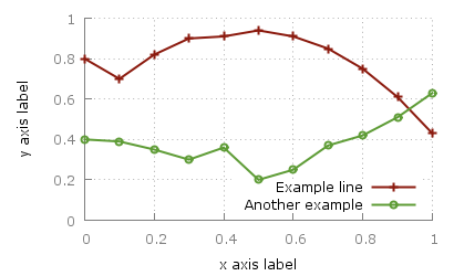
Here’s the data:
# x y1  y2
0.0 0.80 0.40
0.1 0.70 0.39
0.2 0.82 0.35
0.3 0.90 0.30
0.4 0.91 0.36
0.5 0.94 0.20
0.6 0.91 0.25
0.7 0.85 0.37
0.8 0.75 0.42
0.9 0.61 0.51
1.0 0.43 0.63
This is the expected result:
Let’s go!
Time to generate some graphics, this is the first try:
/ # cd /mnt
/mnt # gnuplot nice_web_plot.gnuplot
/mnt # ls -l nice_web_plot.png
-rw-r--r--    1 root     root         14148 Feb 26 22:01 nice_web_plot.png
with this output:
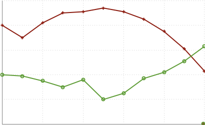
Ouch!
No font, no image
It turns out that there’s not font installed by default, which makes things… difficult:
/mnt # fc-list
/mnt #
Ooops! Let’s install some font:
/mnt # apk --no-cache add ttf-freefont
fetch http://dl-cdn.alpinelinux.org/alpine/v3.9/main/x86_64/APKINDEX.tar.gz
fetch http://dl-cdn.alpinelinux.org/alpine/v3.9/community/x86_64/APKINDEX.tar.gz
(1/5) Installing encodings (1.0.4-r1)
# ...
OK: 43 MiB in 52 packages
Here we go again!
Time to generate some graphics, this is the first try:
/mnt # gnuplot nice_web_plot.gnuplot
/mnt # ls -l nice_web_plot.png
-rw-r--r--    1 root     root         19154 Feb 26 22:07 nice_web_plot.png
The image is bigger, which is promising. Let’s see:
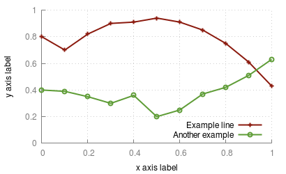
Yay!
So…
… I still stand by my advice: Try with Docker! Even if it made me sweat a bit, it eventually worked fine!